
I am cursed; I know enough about colour to know I don’t know enough about colour. I lack the easy confidence and freedom of the happy-go-lucky which says, ‘Oh cool, those are nice colours,’ and then clusters them happily and irreverently together. I am instead plagued by the indecisiveness of, ‘Those are nice colours, but will they really be right together?’ The rules of colour escape me, and I lack colour intuition. It’s torture.
I’ll give you an example: my temperature blanket.
Critical to a temperature blanket is the choice of colours representing the temperature scale. I know enough to think through the fact that the weather is going to be erratic, so I really want the colour choices to work together on some sort of level so, no matter how hot or cold it is, they won’t uncomfortably jar. This is quite a different consideration to choosing colours I LIKE. I can do ‘colours I like’ very easily, but when I pull colours together based on nothing more than the fact that I like them, they look clownish rather than seamless. Choosing colour is an art.
So I did what I always do when confronted with important colour choices and consulted The Oracle. The Oracle has a name – Pixie-Sarah – and she’s a good friend. (I am a very very lucky person and I actually have two Sarah Oracles, both good friends, both artistic colour-gurus, and both have pets with names that begin with the letter ‘P’. I shall distinguish between them by the names of their pets: Pixie-Sarah and Poppy-Sarah).
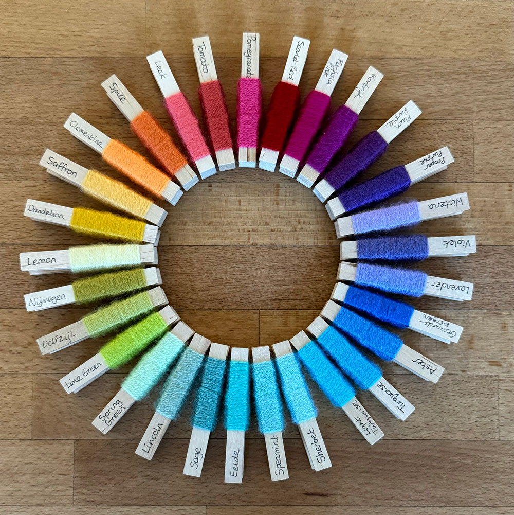
I arrived at Pixie-Sarah’s house equipped with all my yarn pegs made by @bauhiniacrafts, and an ‘I need you’ expression on my face. We embarked on the colour-guru process: all the yarn pegs were tipped on the floor and the process of arranging them begins based on questions from Pixie-Sarah and answers from me.
This is the first thing to note for context: colour-guru people know so much about colour on a very intuitive instinctual level that they don’t realise what a mystery colour is to the rest of us. It’s like me taking a mouthful of the best chocolate ever and saying, ‘Isn’t this yum?’ and not understanding when someone responds ‘Erm, I don’t know’. How can anyone not know if the best chocolate ever is yum or not?
The process starts with Pixie-Sarah asking me a question which triggers two dialogues from me: one she hears me speak, and the other is internal, happening secretly and silently in my head. Pixie-Sarah is a good friend, and I do know her and trust her well enough to fearlessly expose my inadequacies with a simple, “Sarah, I do NOT know what you talking about”, but too many responses like that are an impediment to progress if I want to be involved in the choice at all. So when we discuss colour, I am trying very very hard to understand.
It goes something like this:
Pixie-Sarah: “We need to decide whether we’re going to focus mainly on value or saturation in making these choices”.
Me – internal voice: “WHAT???”
Me – aloud: “Sarah, I do NOT know what you talking about!”
Pixie-Sarah, who is endlessly kind and patient: “OK, do you want these colours to all be the same hue with some being very bright and colourful and others more desaturated, or do you want them to be different hues but the same intensity of colour?”
Me – internal voice: “WUT?!!”
Me – aloud, trying very hard: “Erm, what I’m after is for the different colours to kind-of flow together in a logical way and for nothing to be too jarring when the temperatures jump around”.
Pixie-Sarah, thoughtfully looking at me as if I’ve just told her I’m not sure if chocolate is nice or not, but always patient: “Hmmmm. Ok.” Thinks a bit, then swiftly arranges yarn pegs into two piles. “Something like this…?” Pointing to a pile of colours going from murky to bright. “Or something like this….?” Indicating a pile of clear colours.
Me – aloud, with a frisson of excitement, sensing progress in the air: “Oooo, I like those ones”, pointing to the clear colours.
Pixie-Sarah: “Right, we’re focusing on value then”.
Me – aloud and confidently: “Yup, value”.
Me – internal voice: “Pffffft. As if you know what value is… doofus”.
But, progress begins. Pixie-Sarah slips into the zone and starts sorting through the hundreds of yarn pegs, pulling out colours and arranging them in a long line. I assist (I use the word advisedly) by spotting the ones I like and pulling them out.
Me – aloud: “This is nice, I like this”
Pixie-Sarah: “It’s lovely, but it’s not quite the right colour, it has a bit too much yellow in it”.
At which point, I will look at the yarn peg in my hand, which is very clearly and obviously nothing but green, and squizz hard at it trying to see non-existent yellow. I really like this colour, so I consider arguing the toss and launching a campaign for its inclusion in the growing line of colour.
But I know from experience that this puts Pixie-Sarah in an invidious position where she has to be forced to choose between tolerating the inclusion of ‘yellow’ where it shouldn’t be, or go against her natural kind nature and give me a firm ‘No’. Both positions are triggering for her: one will keep her awake at night bothered about the incorrect presence of yellow in a perfect line of colour, the other will keep her bothered at night by the fact she deprived me of a colour I liked. So, with this in mind …
Me – aloud: “Oh yes, I see it now. You’re right”.
Me – internal voice: “Liar. It’s pure GREEN. I know it’s green. Or … maybe, I don’t. It’s green… isn’t it…? I don’t know”.
I do participate as much as I can, and sometimes I get it right. I’ll pull out a peg and, with a confidence I don’t feel, say, “What about this one? Do you think it might work in here…?” Slotting it into the sequence.
Pixie-Sarah: “Maybe…” Pauses. Thinks.
Me – internal voice: “I got a ‘maybe’…”. I hold my breath.
Pixie-Sarah: “Yes, I like that. That’s good”.
Me – internal voice: “BINGO. I’m a bloody genius!” Fast followed by, “How the hell did I manage to do that?”
Me – aloud, shuffling pegs with contrived nonchalance: “Cool.”
The strange soothing process of pegs shuffling in and out of the line continues, with cats sniffing and one occasionally batting at them curiously. This isn’t a slow process. It takes time. More than an hour, in fact. Every now and then Pixie-Sarah does this thing where she rocks back on her heels, straightens her back, and looks at the line from a higher vantage point, her head tilted to one side. Thinking very important thoughts. I don’t dare interrupt the thinking process. Until eventually …
Pixie-Sarah, decisively: “I think we’ve got it. That’s working for me”.
Me – aloud: “Me too”. No comment from my internal voice because, to be fair, when it’s working, even I know it’s working. I just don’t know why.
I do want to make this claim though: the joining colour was all me. I fell in love with Scheepjes Colour Crafter DK ‘Hasselt’ and had my heart set on it. But I’m not an idiot: I ran it past Pixie-Sarah-the-colour-guru to double check, who thoughtfully took it, and held it against each colour in turn in our selected sequence before saying, “That’s gorgeous. That works”.
Thank god, because I might have had to wrestle her to the floor over that one.
When I started this post with the words, ‘I am cursed; I know enough about colour to know I don’t know enough about colour’, that pretty much is it in a nutshell. It doesn’t make sense to me. I keep thinking there must be a formula I need to crack, like the foundations of mathematics, and everything will fall into place. But, oh no.
I’ll give you an example which totally baffled me via one of Marion Mitchell’s designs (@woolthreadpaint on Instagram). Marion takes the humble granny square associated with incense, oranges and browns, and 70s hippy hair, and she turns them into something else, by doing nothing more than brilliant wizardry with colour. I don’t use the word ‘wizardry’ flippantly; I mean it, I think she has an actual cauldron in her kitchen and she casts complex spells handed down by generations producing colour combinations that only exist in the imaginations of otherworldly secret spirit creatures. These wide-ranging colour combinations that she produces are not of the mortal world.
I embarked on her Beach Walk Blanket pattern, a pattern I’ve had for long enough to become out of date, and quite quickly encountered the heart-stopping horror of discovering that one of the colours, a purple, (Pixie-Sarah is now in my head saying, “Well actually, its not quite purple because…”), had been discontinued by Stylecraft. Oh, dear!
I don’t have a cauldron in my kitchen, so the responsibility of inserting my mortal choice into colours magicked by spirit creatures filled me with apprehension. Instead, I contacted Marion to ask for her recommended substitute, and she gave it: Mint, which is green. What?! The purple is missing and it must be substituted with green? WUT??!! Seriously, what chance do the colour-incompetent like me have when illogical curve balls like that make sense.
Because it does make sense. I don’t know why it makes sense – again it’s the ‘why’ that eludes me – but I’m now on my second Beach Walk Blanket and the mint / green looks lovely even though it really should have been purple and purple looks nothing like mint. Go figure.
Like most people, there was a time when I did understand colour. I knew what the primary colours were and I knew that if I took my yellow wax crayon, and drew over the top of it with my blue wax crayon, I’d get green. So, yes, I do know that there is yellow in green, but I can’t actually see it with my eyes, and yes, I was about six years old when I had all the answers.
As an adult, while sampling colours online using Photoshop, that wax-crayon approach to colour-mixing felt mirrored by Photoshop’s RGB values. These seem to convey the logic that a digital colour is made up of combinations of red, green and blue. (However, the pleasing simplicity of that idea is shattered when someone raises the topic of RGB vs CMYK, or, even more baffling to me, the argument that the red in RGB should be replaced with magenta. And why is it RGB and not RGY when yellow is the other primary colour? I’m not going down those avenues. It makes my head hurt.)
I needed simplicity and a starting point, so, in an effort to find an access point into interpreting my yarn pegs, I started logging all of them in Excel, sampling their colours and keeping a breakdown of their RGB values. Straightforward, right? Well, it’s really really not.
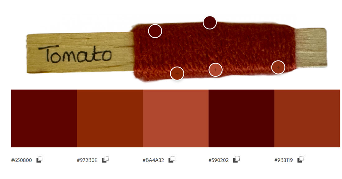
Let’s take Stylecraft Special DK ‘Tomato’ as an example: tomatoes are red, aren’t they? I mean, six year old me who knew all the facts about colour is pretty confident on that point. Unless it’s raw or rotten, but that doesn’t count. Well, when I started sampling ‘Tomato’ to create a hex code that would allow me to explore the colour more meaningfully, I became less sure.

A yarn peg, or yarn itself, is a three dimensional object. The colour of the yarn depends on where the light hits it. In this photo of my ‘Tomato’ yarn peg, all five of these colours are ‘Tomato’. If I could sample more than five, I’m pretty sure I’d be able to come up with ten sampled points on this peg representing one colour, which means there are ten colours masquerading as ‘Tomato’ which in turn is what us mere mortals call ‘red’. Think about that and pause for a moment to pity the colour-incompetent; we really don’t stand a chance. My brain is now trying to see all the tomato colours in ‘Tomato’ and not just the single ‘red’ one my brain insists should exist.
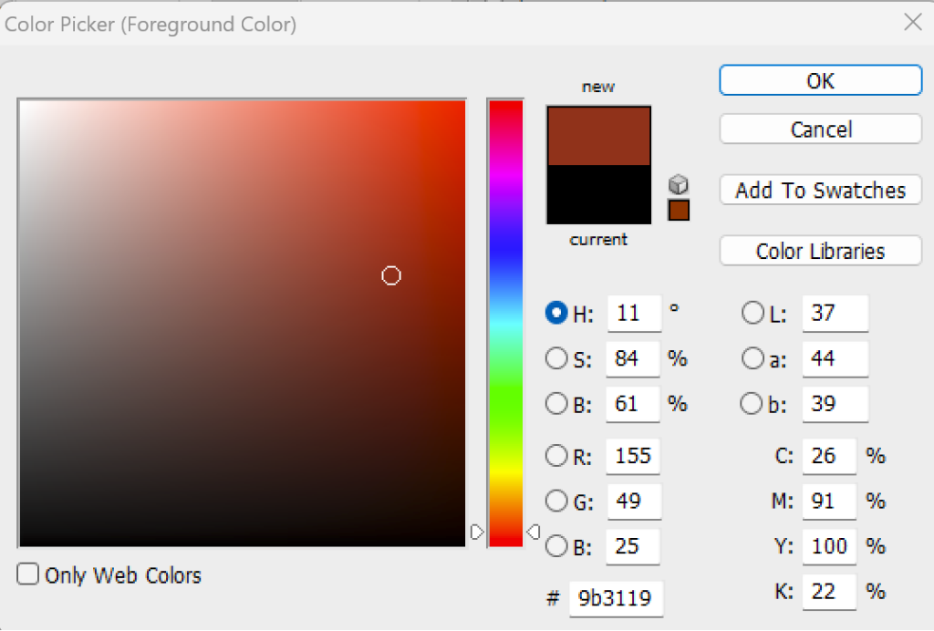
Photoshop tells me the CMYK percentage values of Tomato too: Cyan = 26%, Magenta = 91%, Yellow = 100% and K (Black) = 22% . (I’m not even going to discuss the sudden appearance of black labelled with a very confusing ‘K’. Why would anyone do that to me – why, why, why?) But CMYK tells me – but only because I sampled it in Photoshop – that if I were to ever want a palette of reds, Pixie-Sarah might reject Tomato as being too yellow. WUT?! Here’s a thought: I might ask for a palette of reds just so I can reject tomato ahead of her and surprise her by appearing unusually colour astute.
So how do the colour gurus see this so easily and intuitively? I have this theory that their brains are like gambling slot-machines. Looking at the yarn is like pulling the handle, setting off whirring cogs that settle and display C=26%, M=91%, Y=100% instead of apples and oranges. And instead of bells tinkling, signalling a jackpot, the conclusive words, “That red is yellow” comes out their mouths. Either that or they make spells the way Marion does.
Is it possible to learn this? Am I seriously faced with the prospect of memorising all the RGB or CMYK values for every single one of my yarn pegs? If so, there’s zero chance of that helping me; I can’t remember where I left my keys this morning, never mind remember multiple values for hundreds of colours.
So where does that leave me? I have so many projects swimming in my head, so many colour decisions to make, but the obscure world of colour confounds me. But I haven’t given up yet and am always on the hunt for resources that might help.
In the meanwhile, I have my trusty oracle to fall back on when I need help: Pixie-Sarah. I will do my very very best to learn from her and truly really see colour. I’m trying very hard. Do you see what I mean when I say I know enough about colour to know I don’t know enough about colour? And if anyone has any tips, or suggestions of resources that will help me develop my colour intuition further, please pop them in the comments. Please don’t leave comments pointing out I’ve said all sorts of incorrect things in this post; I already know I know not much about colour. That’s the whole point.